|
 How to change pre-set font styles How to change pre-set font styles
You can edit the style of your text at anytime. When you re-publish your pages, the entire site will be updated with the new style, providing that you have saved your scheme changes.
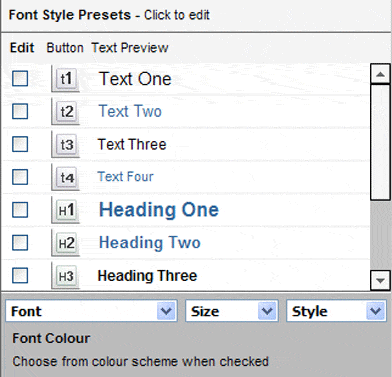
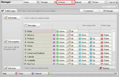
The area to the left of the Schemes screen, as shown below, contains a list of all the available font styles. It will show them exactly as you have selected. The fonts relate directly to the buttons in the Page Editor.


Font Style
To edit a font style, check the box next to the font style you wish to change. You will notice that there is a graphic button, exactly the same as in the Page Editor which correlates directly to that particular font style.
Once the box is selected you can click the drop down boxes to select your style changes. You will see the text preview change to the style you have chosen.
If you wish to change the font you may do so by selecting from the drop down list under the scrolling list of font styles. You can also adjust the size and style attributes in the same manner.
We have arranged the default sets so that T4 is the smallest and T1 is the largest - but you can change this if you prefer.
The list of available fonts is restricted to default Windows Operating System fonts. The reason for this is to ensure consistency in viewing the web site on any machine. If a non-standard font was to be used, it can not be guaranteed that the page will display correctly on a different machine that does not have the relevant font installed. Additionally, only a handful of Fonts are designed for on screen viewing.

Setting the font style for each button
You can edit each font size and style button individually to do this follow this procedure for each button:
- Select the button you wish to set up by clicking the check box the left, when selected a tick will appear in the box.
- Select a font from the list of available fonts. Note: To ensure consistency and good design we strongly recommend that you use the same font for all your font style presets.
- Select a size from the drop down list the sizes shown are point sizes.
- Select a style from the drop down list. It is also possible to add styles from the Page Editor.
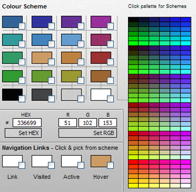
- Finally, select a colour from the 20 colours listed shown in your chosen colour scheme.
You have seven font size and style and pre-set buttons: four for standard text and three for headings. The reason for the limitation is to provide some level of consistency across your web site.
Save the scheme to store your changes. The results can be seen on the live site when the site has been published.

Navigation Links in the Content
If you scroll down in the Font Style Pre-sets box you will see that you can set colour and style for your links. These are the links that appear in the content.
You can not set the font type or size. This is because the font type and size is controlled by the surrounding text in your content.
Example: If you have a paragraph with 10pt Arial text in black and wish to link a word in that sentence to another page, the font type and size for the link would still be 10pt Arial, but it would be highlighted in the colour and style that you set. So you may choose to have Blue links with an Underline style. So, your link in this paragraph would be 10pt Arial (as set by the paragraph) blue with an underline.
You can set the following:
Link Colour
This is the standard colour for links in the content of your pages.
Visited colour
This is the colour for a link in the content of your pages that has already been visited.
Active colour
This is the colour for a link in the content of your pages when the link is clicked.
Hover colour
This is the colour for a link in the content of your pages for when the mouse moves over the link.
Adding additional styling
In the styles drop down box for each of the above, you can choose from Normal (no additional formatting) and Underlined links.

Navigation Bar Links
The navigation bar links are treated in a slightly different way to the content area links.The colour for the links is set in the Scheme Manager in the navigation links section.
You can set the following:
Link Colour
This is the standard colour for links in the Navigation Bar.
Visited colour
This is the colour for a link in the Navigation Bar that has already been visited.
Active colour
This is the colour for a link in the Navigation Bar when the link is clicked.
Hover colour
This is the colour for a link in the Navigation Bar for when the mouse moves over the link.
[ top of page ] | 


